Handwriting and photos
Turn your own writing into a real font. Use the printable sheet for the best result, or any photo of writing you already have.
There are two photo routes. Both end with the same thing: a font family with spacing, kerning, accents and a Studio app.
| The sheet | Quick photo | |
|---|---|---|
| You need | a printer and a dark pen | any photo of writing |
| Letters from your hand | all of them | only the ones in the photo |
| Best for | your own handwriting font | a note, a sign, a whiteboard |
The sheet, step by step
1. Get the sheet
Download punchcutter-handwriting-sheets.pdf, or ask Punchcutter for it. It is two pages and prints on A4 or US Letter.
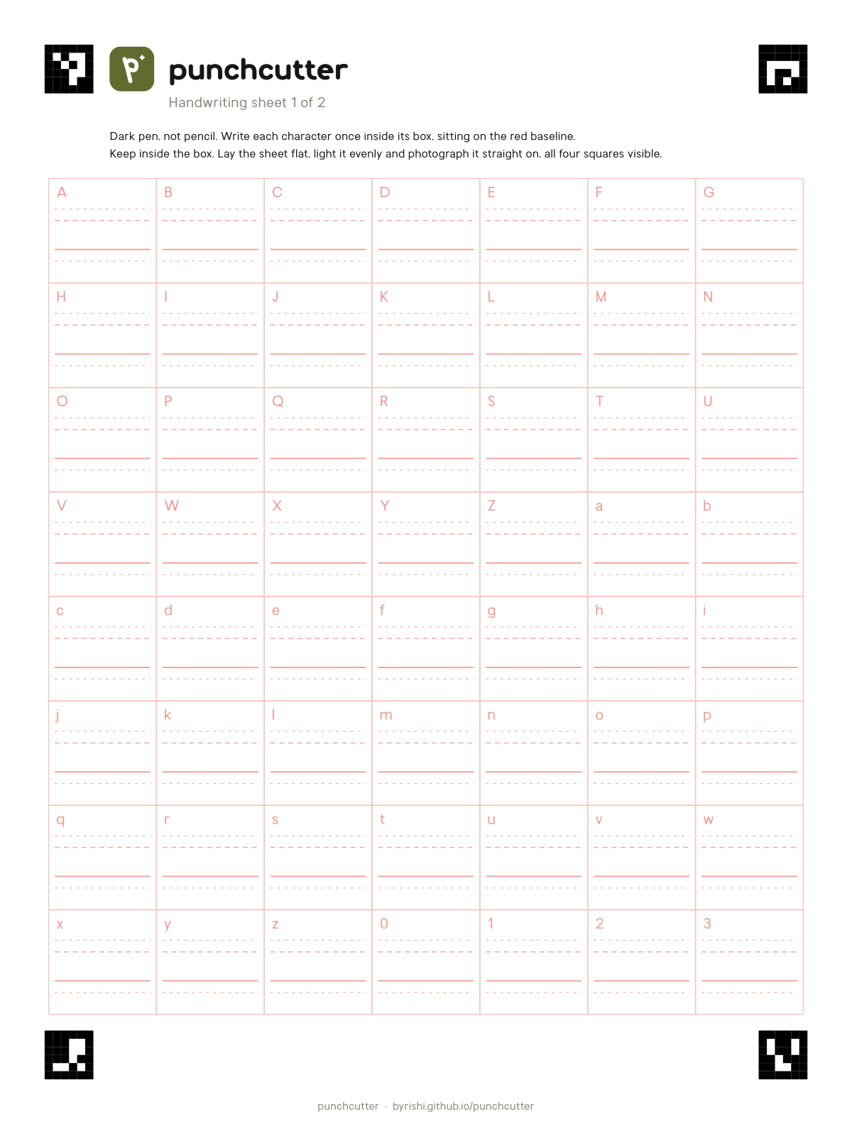
Page 1 has A to Z, a to z and 0 to 3. Page 2 has the other figures, punctuation and currency. Page 1 alone is enough; Punchcutter draws anything you skip at your stroke weight.
2. Fill it in
- Use a dark pen or marker. Black or dark blue ballpoint, gel pen or felt tip all work. Pencil is too faint.
- Write one character per box, sitting on the solid red line.
- Capitals reach the top dashed line. Small letters like x reach the middle line.
- Keep each letter inside its box, not touching the edge.
- Avoid red or pink ink; the red guides are removed when the photo is read.
Write the way you normally write. Punchcutter keeps your shapes; you can tidy them later.
3. Photograph it
- Lay the page flat in even light, with no shadow from your phone.
- Get all four black corner squares in the frame. Any angle is fine; the corners square the page up.
- Make sure it is in focus. Closer is better than wider.
4. Send it
In Claude, ChatGPT or any connected agent, attach the photo and say "make my handwriting into a font". Send both pages together if you filled in page 2.
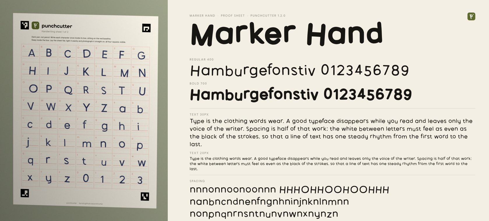
Punchcutter squares up the page, drops the red guides, traces every letter, measures your x-height and stroke weight, and builds the family. You see a proof first, then the Studio and the font files.
Quick photo, step by step
Any photo of writing works: a notebook page, a napkin, a whiteboard, a sign you painted.
- Write on plain paper with letters that do not touch. To cover a to z in one line, write "Sphinx of black quartz, judge my vow".
- Photograph it straight on, in even light.
- Send it and say "make a font from this".
Punchcutter finds every character and numbers it on an image. It reads which number is which letter, shows you its reading, and traces them. Letters that were not in the photo are drawn by the engine to match, and the report tells you how much of the font came from your writing.
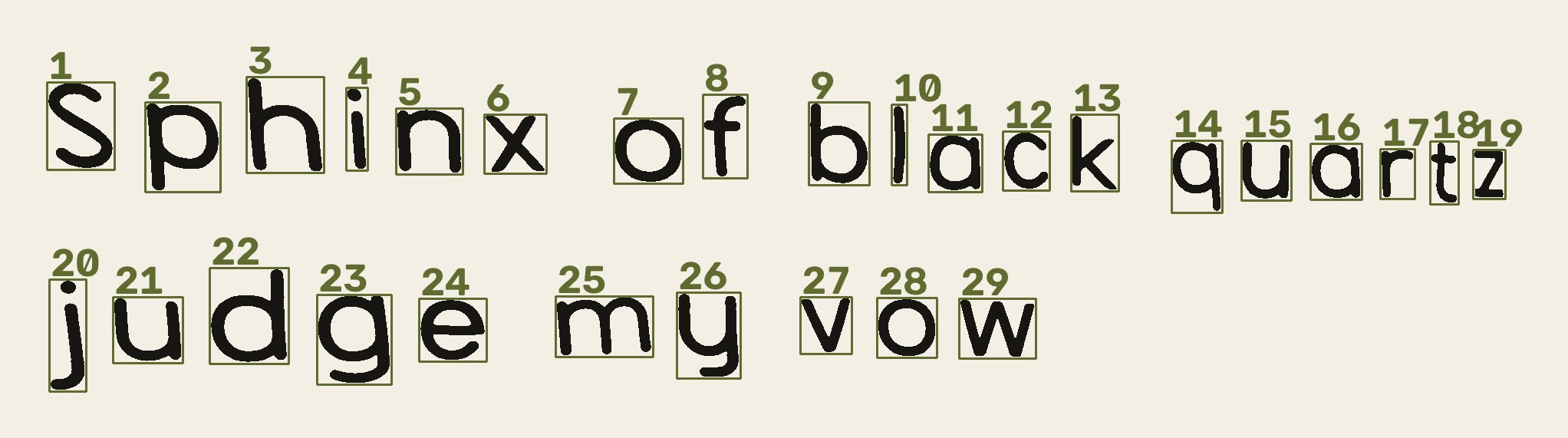
If a letter is read wrong, say so: "number 14 is an r, not a v". Only use lettering you made or own.
Make it cleaner or messier
After the first build, ask for changes in plain words. Each one rebuilds the font from the same photo.
| Say | What changes | Option |
|---|---|---|
| "cleaner", "more finished" | every stroke is redrawn with one steady pen | --even |
| "neater", "line it up" | letters share heights, like type | --neat 0.9 |
| "keep it messy" | every wobble and bounce stays | --neat 0 |
| "thicker" | heavier strokes | --ink 20 |
| "thinner" | lighter strokes, open counters | --ink -15 |
| "add a bold" | a second weight grown from your strokes | --weights 400,700 |
For a phone photo of ballpoint, --even --neat 0.9 is usually the best start. --even traces the centre line of each stroke and redraws it at one even width, so blots, faint lines, breaks and ragged edges go while your letter shapes stay.
From the terminal
The same routes without an AI:
# the sheet
punchcutter sheet --out sheets                  # print sheets/punchcutter-handwriting-sheets.pdf
punchcutter read-sheet page1.jpg page2.jpg --family "My Hand" --even --neat 0.9
punchcutter build "My Hand/MyHand.json"

# any photo
punchcutter segment note.jpg --out seg          # writes seg/segments.png with numbered boxes
punchcutter label seg --family "My Hand" --text "Sphinxofblackquartzjudgemyvow" --even
punchcutter build "My Hand/MyHand.json"
--text lists the characters in the numbered order, without spaces. To name only some boxes, use --map '{"1":"S","2":"p"}'. Every option is in the CLI reference.
What the engine measures
| Measured | Used for |
|---|---|
| Cap height | scaled so capitals are 700 units |
| x-height, ascender, descender | the font's vertical metrics |
| Stroke width | the weight of every letter the engine draws for you, so they match |
| Each letter's ink | traced to smooth curves |
Problems and fixes
| Symptom | Fix |
|---|---|
| "Could not find the sheet's corner squares" | retake with all four squares visible, less glare, a little closer |
| "touching the box edge" | that letter may be cut off; rewrite it smaller, or accept it |
| A letter is missing | it was too faint; rewrite it darker, or let the engine draw it |
| Letters look broken or blotchy | ask for "cleaner" (--even) |
| a and e look like blobs | ask for "thinner" (--ink -15), or use a finer pen |
| Letters look ragged | the photo was blurry or small; retake it closer |
| Letters bounce on the line | ask for "neater" (--neat 0.9) |
| Joined letters were found as one shape | write them apart, or skip that shape in the label map |
| Wrong letter in a box | rewrite it on a fresh sheet and send both photos together |
Handwriting fonts are print-style: each letter stands alone, and they ship as static weights. See Use your font to install it.